Jordans Popped Campaign
Client
Jordans Cereals
SERVICES
Campaign Identity

the brief
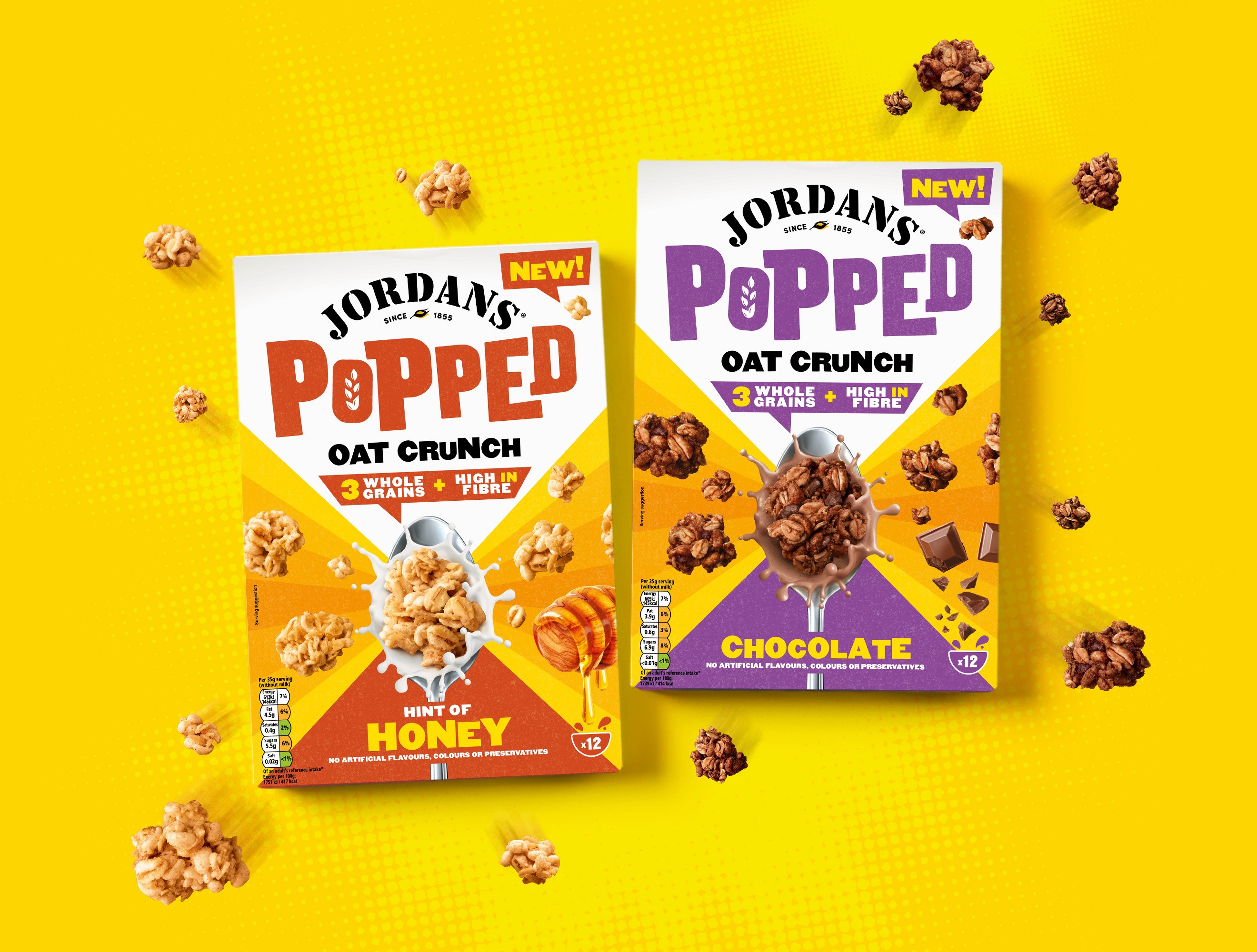
Jordans latest product launch "Popped Oat Crunch" is breaking free from the wholesome section of cereals and into the everyday cereal category, competing with the biggest brands in the business. With a pack designed, a cohesive visual identity is required to call consumers to action and enable the product to stand out online, in store and on social.
execution
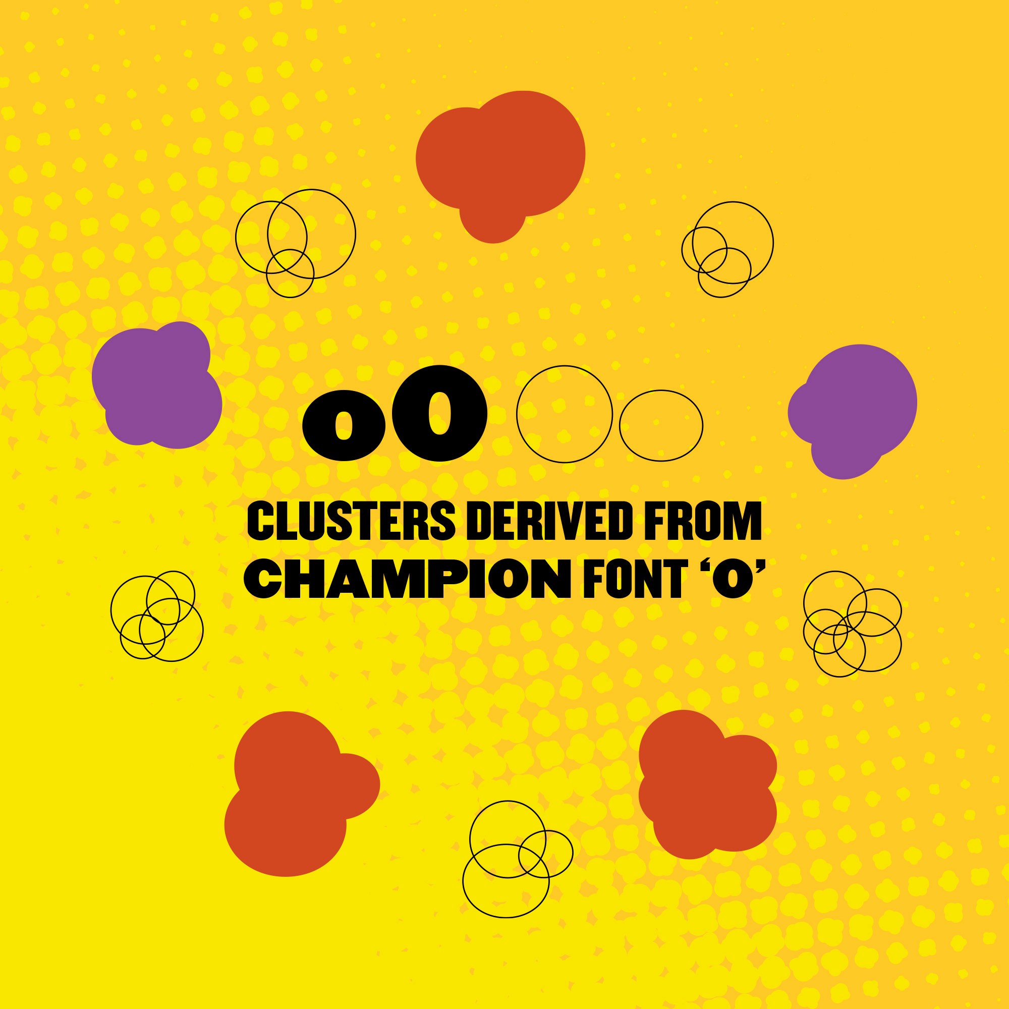
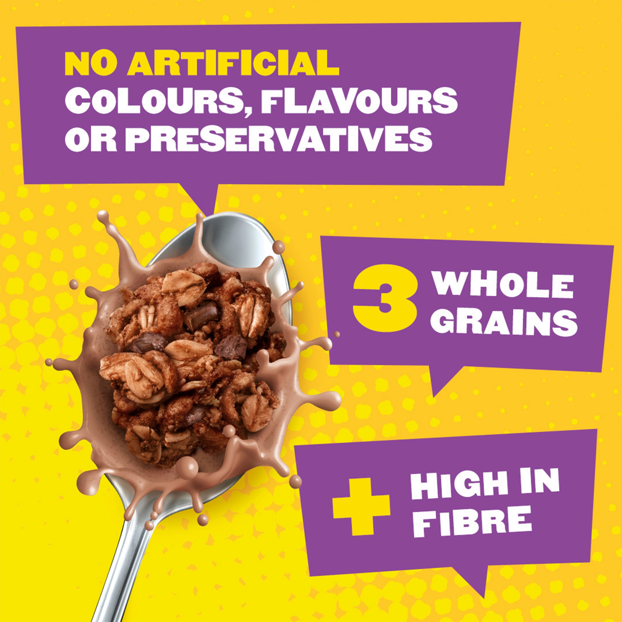
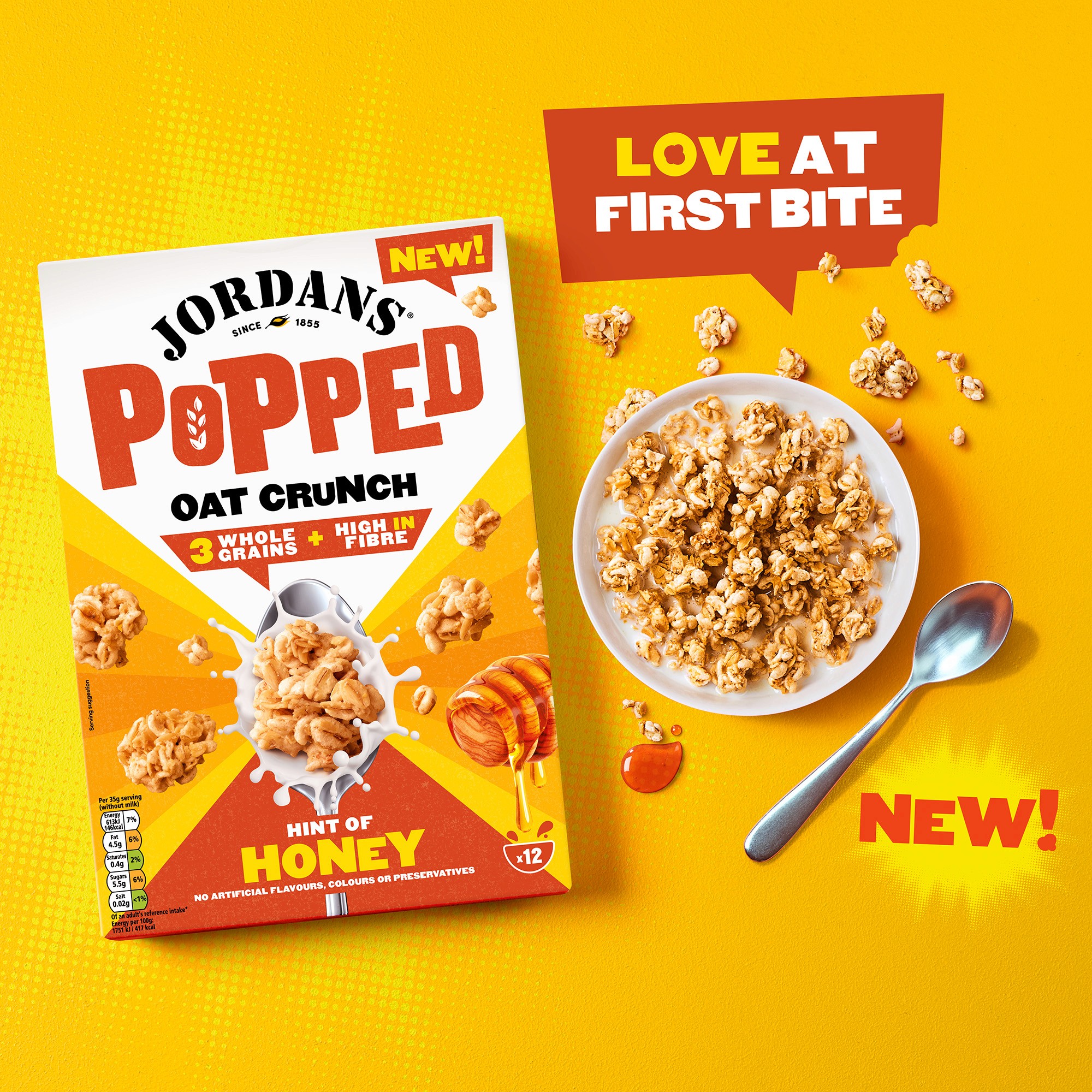
The pack design of Popped deliberately stood out and broke the norms of the usual wholesome Jordans range, so the identity needed to do the same. Jordans look and feel at the time focused on green fields and the heritage of british farming. So this needs to pop (pardon the pun). Utilising the bright yellow as the key colour from packs and the vibrant contrasting purple and orange from the flavour variants helped to create something completely new for Jordans. Small details like the clusters pop-art inspired background to elevate off the page and utilising comic book speech bubbles off the box created a modern comic book aesthetic associated with punch and impact, ensuring Popped would stand out from the crowd.
result
Utilising our go to structure for any new key visual, we made sure that this not only looked great but would be as versatile as possible for any media planned upon launch. A striking and vibrant campaign identity resulted in the perfect foundations to easily roll out across in store shippers, aisle fins, online banners, social media and everything inbetween.