Jordans Cereals Corporate Rebrand
Client
Jordans Cereals Corporate
SERVICES
Corporate Identity & Values

the brief
Previously JDR (Jordans, Dorset & Ryvita), the newly named Jordans Cereals needs a new identity and overhaul. Replacing a dated and impractical logo lock up that has no guidelines or visual cohesion, with a brand new contemporary design. Something that inhabits Jordans the brand but clearly stands out from the packaging and brand guidelines as it's own corporate entity. Re-using the Jordans brand logo for the parent company is not an option, to ensure that if the brand logo is ever redesigned in the future, that the corporate logo and all associated assets such as signage on site do not need an overhaul.
execution
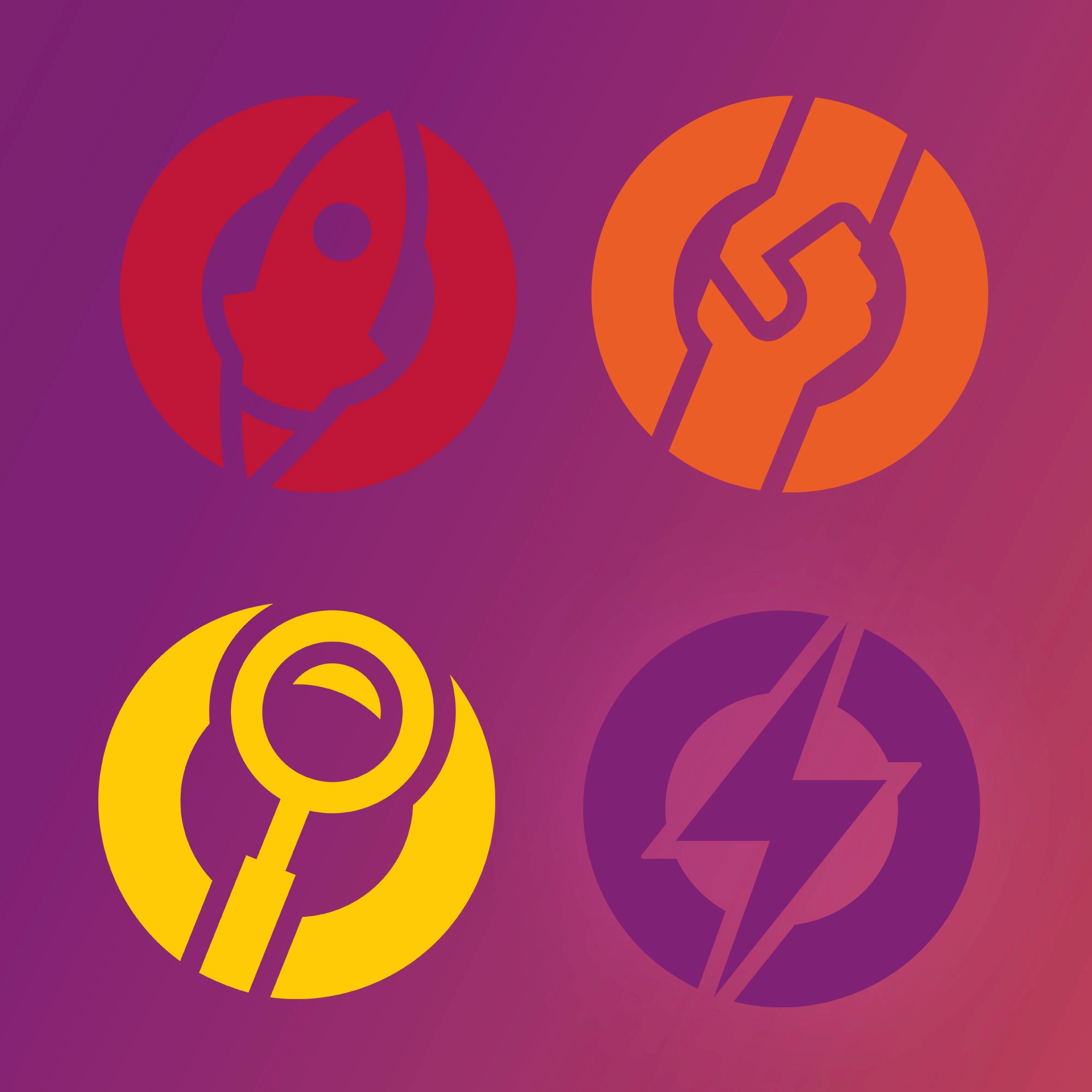
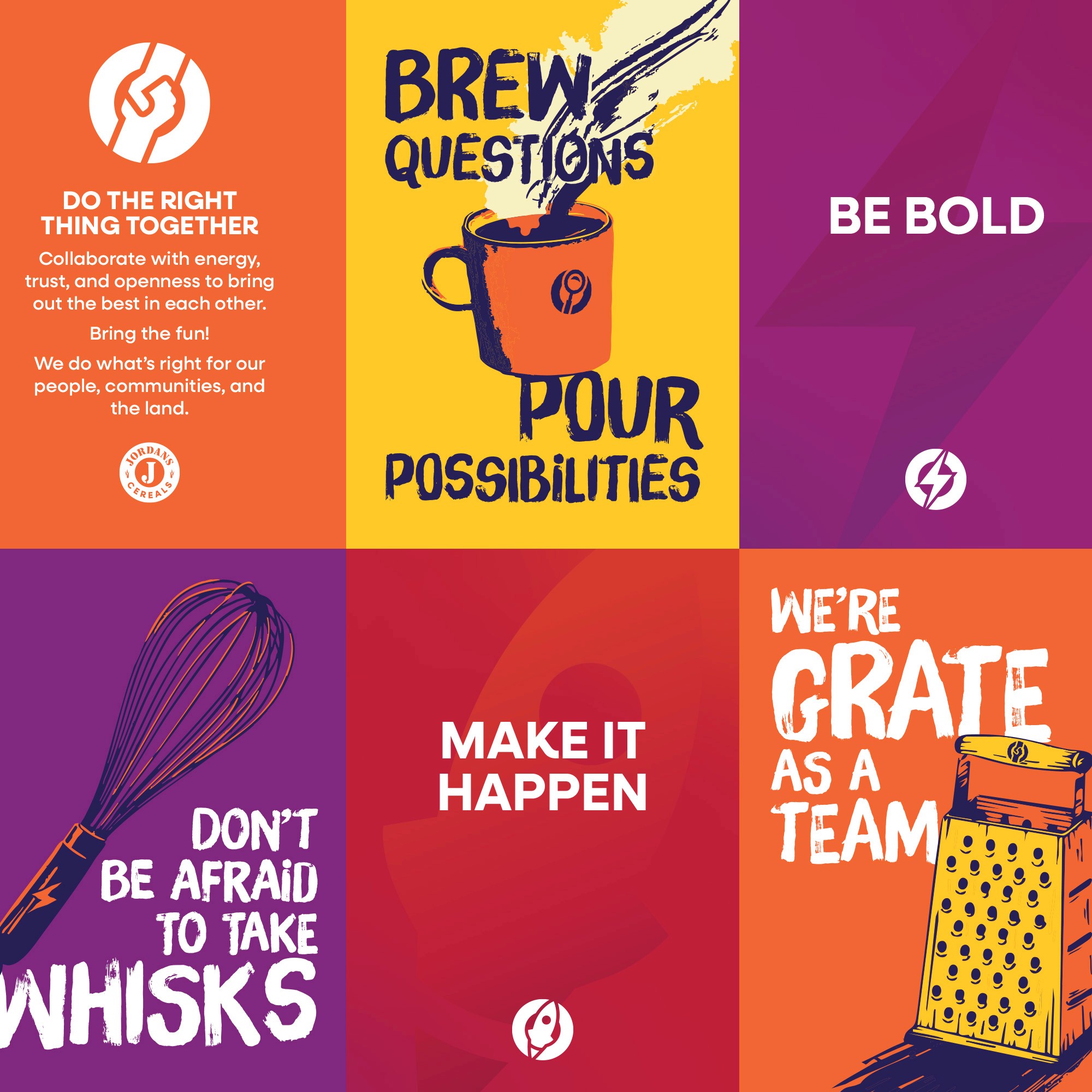
The challenge was to ensure Jordans Cereals utilised distinctive brand assets from the Jordans brand, without becoming confusing and too similar. One aspect of this we wanted to utilise was curvature of the 'Jordans' arch. Through experimentation it became clear that using this in a circular emblem fashion would keep the arch but create a different overall visual shape versus the brand logo. The Jordans 'J' became the obvious choice of consistent inconogrpahy to use. It inhabits our heritage, where we have come from and isn't utilised in our branding currently. It provided a conisistent shape, set of curves and an asset that elevates content rather than dominates. The circular badge shape presented itself as a straightforward frame that could house many different assets, partiuarly the value icons, meaning everything would be modern, stylish, clean and within the same visual family.
result
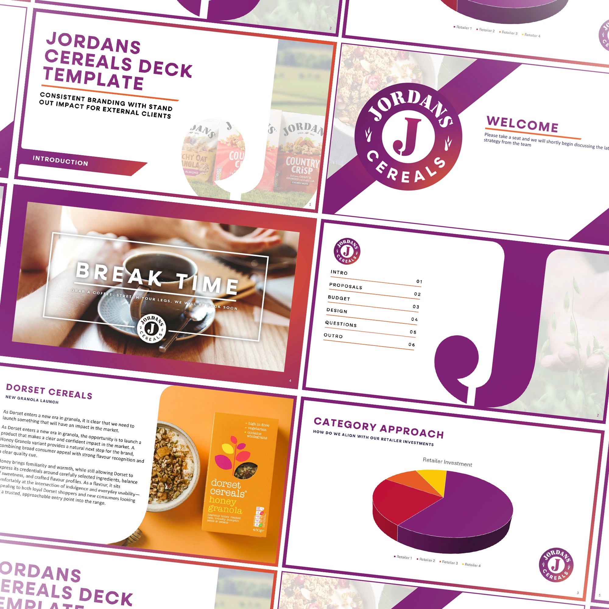
In just a month of work to speed up a quick corporate transition, we went from a funcitonal logo with no supporting identity, to a completely distinctive rebrand with colours, fonts and key assets that embody the new horizon and direction that Jordans Cereals as a business has begun. Going from no consistent colour to a striking purple that stands out from the competition and brings an exciting new energy to everything it touches around the office. Everything from signage to internal comms can easily be created from the new assets and guidelines.