Ryvita Fibre Fit Campaign
Client
Ryvita
SERVICES
Logo Design & Campaign Identity

the brief
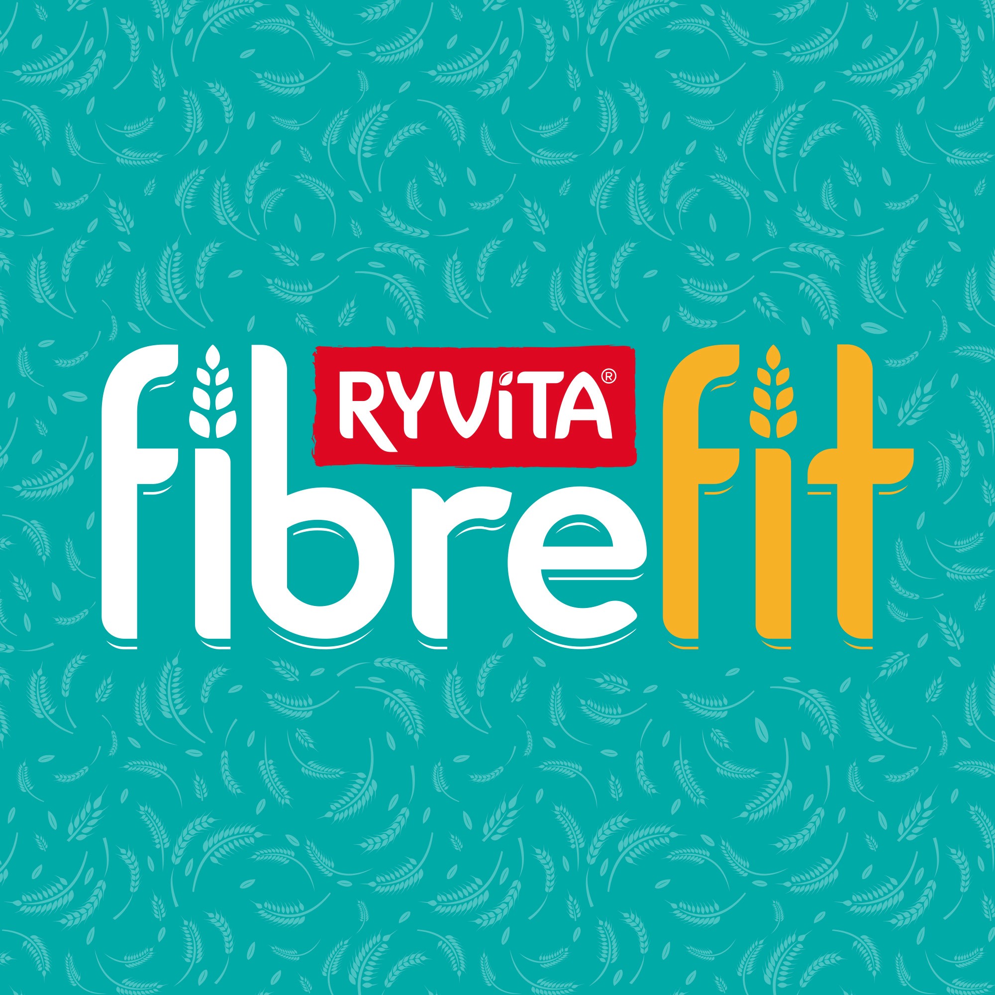
Ryvita is launching Fibre Fit. More than just a comms campaign, Ryvita is helping the nation get in touch with their gut. Prioneering our need to eat more fibre and improve our gut health. The campaign will need a logo and identity that utilises the Ryvita look and feel, but distinctly stands out and can be transferred in store, on social and shape the visual direction for a Fibre Fit tracking app.
execution
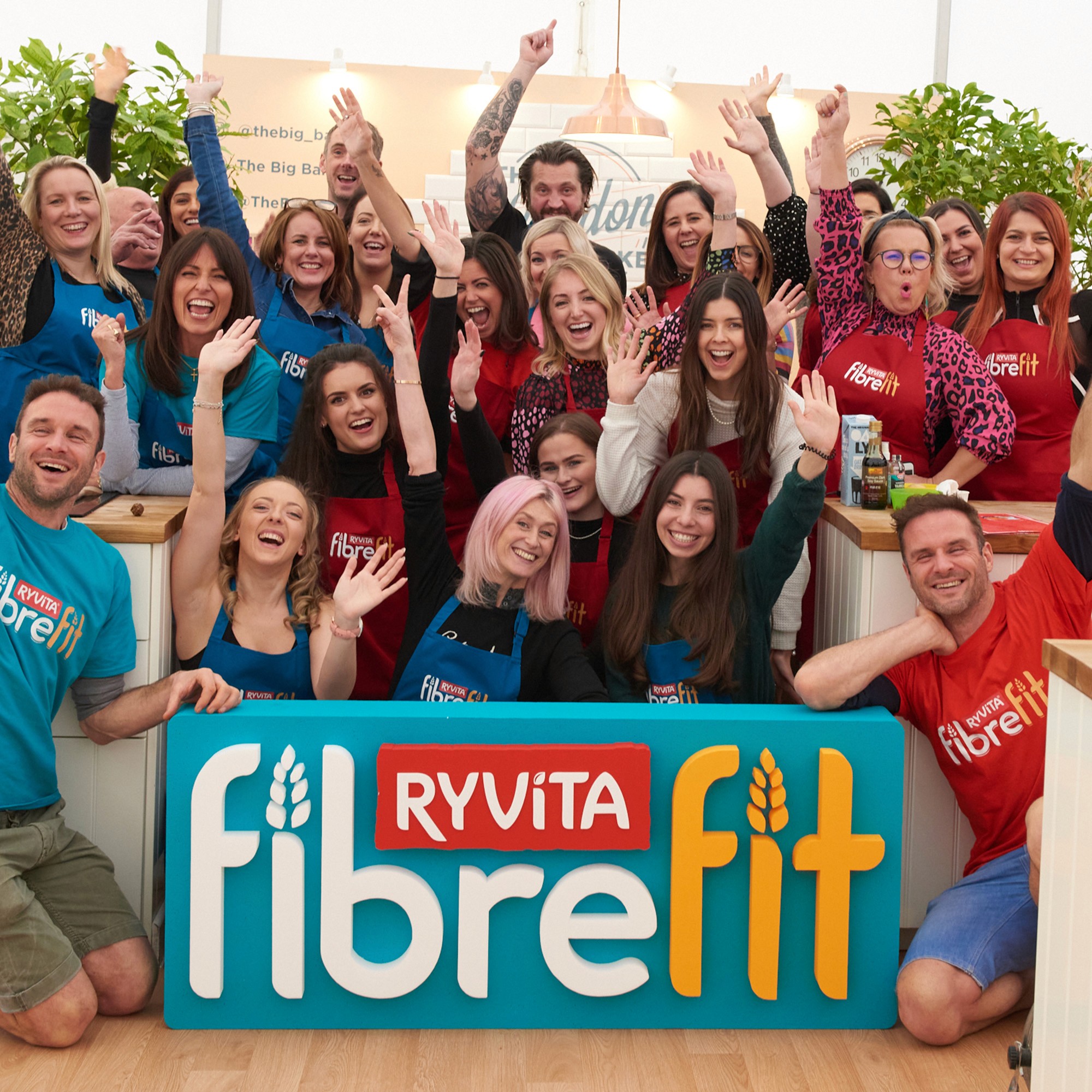
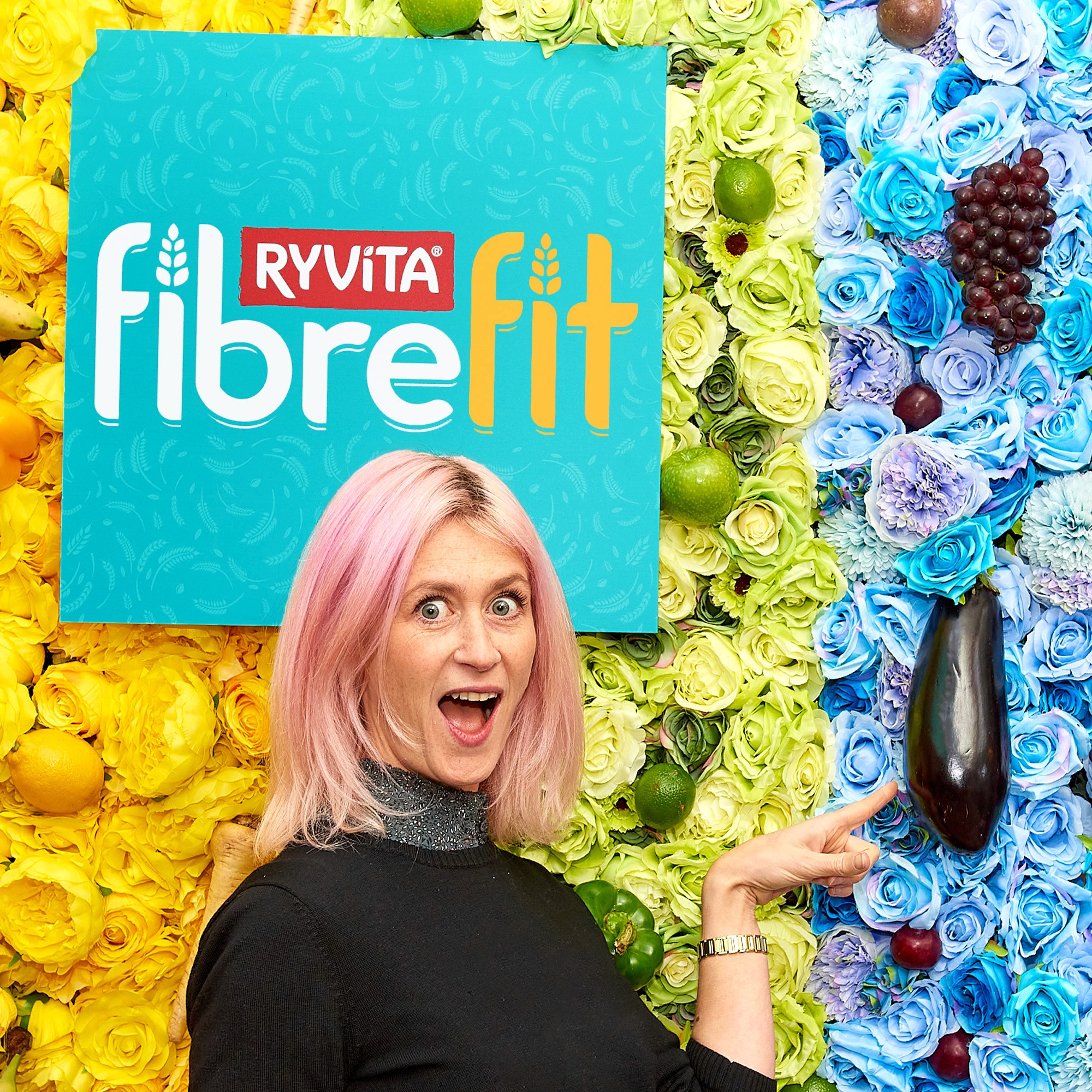
Ryvita's look and feel at the time was becoming dated, so this was the first campaign during a significant packaging and brand overhaul that needed to start the shift into modern and contemporary design. We utilised the distinctive brand assets in play that could still be associated with Ryvita (e.g. the wheatsheaf repeating pattern). The Fibre Fit wordmark had to have it's own identity but feature the Ryvita logo in it's word mark for recognition, the sort of challenging request that makes a brief exciting. A modern teal that represented fitness and health would feel right at home in the app and allowed a suite of contemporary assets for the new Ryvita.
result
A clean and distinct wordmark that emobdied the style associated with the most popular fitness brands/apps, built in a way that could encompass the Ryvita logo seamlessly. Supported by an identity that visualised health and wouldn't be out of place in your gym chain. Ryvita's Fibre Fit launch was a huge success as one of the first major UK campaigns to tackle gut health that can be seen being utilised by every brand on shelves today.